vendredi 7 décembre 2012

Skeleton

One of my friends asked me in June to make a card for her, containing the traditional Hungarian house blessing, for some friends of hers who were getting married.  Only, she didn't need it coloured in, as she was going to make it into an embroidery pattern.  So, I ended up taking an embroidery pattern, making it a calligraphy project, so it could be turned into an embroidery project.


A note about the house blessing...  Most Hungarian homes (or, at least those I've been to) have one of these somewhere, with some form of decoration (usually Kalocsai).  The text is (here comes another horrid translation):

"Where there is faith, there is love
Where there is love, there is peace
Where there is peace, there is blessing
Where there is blessing, there is God
Where God is,
There is no need"

Or, more tersely,

"Where faith, there love
Where love, there peace
Where peace, there blessing
Where blessing, there God
Where God
There is no need"

As a result of it being designed as an embroidery pattern (with lettering), the various parts of the flowers had to be visible, which is why the design was left in a "bare bones" stage, and why it was only done in black.  I'm rather pleased with how striking the monochrome effect turned out to be.  And how popular the resulting work ended up being!  I had one friend make it their Facebook cover photo, and I had another ask if he could get an identical project (coloured in, of course).


The reason I've so delayed with posting this, is because it just feels too short.  However, since there is no colouring, that's about 2-4 hours of work that didn't get done...  So, short and sweet.

samedi 20 octobre 2012

Colourblast


I know, I know, I've been remiss in not updating the blog...  I went on holidays this summer, and real life took a little more time than I wanted it to.  But I'm back!

So--back to business it is!

In October of 2011, while at another one of the many innumerable scout camps I attend (yes, it's hyperbole, but it feels that way sometimes), I had brought some of my work with me, because I wanted to pick a more knowledgeable friend than I's brain (I hope that statement made sense) about the colour scheme for a project I was planning on working on.  Unfortunately, the colour scheme was too complicated for me at that point, so I decided to select another design, and proceeded to create that one (This turned out to be Switcheroo).

As it would happen, one of my friends either asked me to make one, or I volunteered to make one, or a bit of both.  She said that she'd be happy with whatever I create, so I felt free to select a design from a region that I hadn't attempted before (incidentally, this happened to be a different village, from the same region as the original Switcheroo was supposed to be.  Funny, that).  In an attempt to "streamline" my production methods, I started working on two projects concurrently, the other one being Embroidery.

Now, and I ascribe this to be 100% part of the learning curve, it happened that one of the background textiles for these two concurrent projects was 'unbleached linen', the other 'white felt'.  For some reason, I decided to dye both sheets.  The usual tea-dye process.  Quite simple, and a relatively easy way to get rid of old tea bags that won't be drunk (because, well, they're bagged tea, not loose leaf.  But that's another topic entirely).  Both sheets were slightly dyed, a coat or two, and then I put this one aside, to concentrate on Embroidery, which was due considerably sooner.  Once that was done, it was back to this, and this is where the problems started...

One thing that I've been learning (and I'm still learning, much to my dismay, at times), is to really, really, REALLY pay close attention to the colour scheme, and inspect it carefully.  Somehow, I looked at it, saw that it was more or less a mirror-image design, easy as pie.  So I started colouring it; I finished the central flower, and thought that it looked quite odd with what I presumed to be a central flower of red, and an outer flower of differing colours, but, red again.  It was only when I decided to take a longer look at the scheme that I realized that, while indeed, the inner flower on the two outer flowers were of one colour, the central flower was the same, inside and out, separated only by a thin thread of green.  Oops.  I tried erasing the inner ring of red, but wouldn't you know it, those darn artist coloured pencils are quite difficult to erase!  And I didn't want to start problem-solving on the project ("Can I erase more?  No.  Can I scrape off the layer of colour?  Yes, but now the sheet's uneven."), so, I was left with one solution:  restart.  Which I did.

Oops.
 This time around, due to time constraints, I didn't dye the sheet.  Which means that of the two sheets that were dyed (remember Embroidery?), the one that shouldn't have been dyed was, and the one that should have been, now wasn't.  Odd, that.  Colouring went well--as long as I had a scheme to follow.  Then, suddenly, the colour indications stopped (somewhere around the middle of the design, meaning that for the right side, I was on my own, as I was for the birds, and the central stitching).  Well, not quite.  The central "wave" of stitching had the colours indicated, but not where each colour should start and stop.  But, I seem to have figured out well enough on my own.
 
Much better.

Once that was done, all that was left was the writing.  I'd managed to find a greeting I liked, so that was no problem.

Now, if you've been reading past posts, you'll have noticed that there's always something I'm dissatisfied with in my projects; something that I may have been satisfied with at the beginning, but with distance, I shake my head at:  and we're now at that point.

I'm not dissatisfied with the choice of text.  I'm dissatisfied with how I chose to present it.

I have a marked preference for medieval scripts (carolingian, gothic, and uncials, mainly), and this time around I chose to use an insular minuscule.  Only, for some odd reason, I decided I would incorporate an aspect of another post-uncial minuscule (Luxeuil minuscule):  ligatures.  And this took away from the legibility of the text.  Insular minuscule is not a ligatured script, and yet I insisted on combining 'E' with its following letters" 'z', 'n', etc.  But the problem is most marked with the word "szeretet" ("love"), which looks more like "SzErEcEc".  I also should have reduced the size of the 'e''s and 's''s.  They look odd being so large when everything else is small (and especially so in the middle of a word!)

Another project done, another lesson learned, and more knowledge as to how to accomplish the perfection I so seek in calligraphy...

dimanche 15 avril 2012

Embroidery. Just for Men.

So far, all my projects have been made for my lady friends (I know, it's a stilted phrase, but you'll understand). I've been uncertain how to approach my male friends on the idea... "Hey! I made you a card with pretty writing and flowers!" "You're a dork, Georges..." So I was quite pleased when I was talking with one of my friends from New York, when we agreed to an exchange--he would carve me a spoon, I would make him a card. Thankfully, my main resource for the patterns I use for embroidery had a number of designs, from different regions, that would beyond the common colourful patterns Kalocsa, and Palócföld (Kalocsa is a small town in southern Hungary, and Palócföld is a region in northern Hungary, for those who haven't been here since the beginning). There were also a few patterns from what are called "cifraszűr".

Cifraszűr need to be described... These were felt "overcoats", which Hungarian shepherds wore. They were made of felt, and were quite warm (including in the summer, although they weren't unbearably hot). The interesting thing about them, is the embroidery. These were embroidered with wool, not cotton or linen thread. They were also only embroidered by men, the "szűrszabó", which were formed into 'guilds' in the main centres of production. And, as the cifraszűr was found in many different areas of Hungary, while the overall form was the same, with few differences (the sleeves would be long, which was the main type, or they would be short, "stubby" things sown shut with a "plug", and used as pockets. These last forms were more common west of the Tisza river). They would be richly decorated; the back panel, hanging from the shoulders would often be richly decorated, and have rosettes at the corners. The lapels on the front would be decorated, and often stretched to the bottom edge, which would itself be decorated, as would the seam at the back, and the waistline. They were also "closed" with a buckle at chest-height. One of my favourite articles of Hungarian clothing, which I would dearly love to acquire an example of! (Unfortunately, I have been unable to find a usable picture of a cifraszűr. But it's easily Googleable.)


One of the first things I had to do with this project was actually dye the paper. Yes, good old-fashioned tea-dyeing, to give it the look of white felt, which, of course, wasn't "printer-paper white". This had the side-effect of curling the paper, since I had a short time in which to dye it, let it dry, and trace the design, before I left for a visit to Québec City. Thankfully, as a result of storing it in a portfolio, it's now lying quite flat. The colours were an interesting discovery. So far, I'd been able to get away with using plain colours, without having to blend (I definitely don't have an art background...), but the colour scheme for this one was red, pink, and... dark and light "Bordeaux" (which is in itself a dark red). Which meant I had to discover the secret to blending colours. In this case, I think I succeeded quite well.

What surprised me, was the amount of red involved. How red it was. Of course, the colour scheme showed where the red would be, but I've yet to be able to visualize the colours on a blank design. The pink and bordeauxs softened much of the initial shock as to how red it was, but I recall wondering whether I'd made a smart choice in design. And since I was using watercolour pencils for the first time, I didn't realize that they would rub, and I ended up with a nice red glow around the design itself. Which was for the most part subsequently erased, after having shifted my hand and arm position for the remaining colours (touch the paper as little as possible!).


The greeting was another problem. Since this was a birthday card, it had to have the appropriate greetings of goodwill, happiness, etc., etc., but I didn't want something along the lines of "all the stars are dancing for you, because an angel told me it was your birthday". Sometimes I'd think I found one, and then later reread it, and decide against it. Finally, one said (get ready, this will be a horrible translation) "I wish the days of your life will be like the surf of a clear brook". It sounds better in Hungarian.

Early on, I had decided to use a Gothic script for this one (it seemed more "manly" than most of the other scripts I'd used to this point. But certain types of Gothic can be quite difficult to read when written in large amounts, since the excellence of Gothic isn't judged by the individual letter or word, but rather by the appearance of the entire sheet. If the page looks even, equal, nothing standing out, it looks like it was "woven", it's a good example. If there are "holes", or if something stands out, it loses its cohesion. One of my books had an example of Gothic with "spiked" foot serifs, which lent weight to the script. Combining this with my script, it kept it readable, but also accentuated the letters themselves, without taking away from the overall appearance.

He was well pleased. Enough said.

lundi 9 avril 2012

Redbirds

Things seem to have begun panning out. At the beginning of March, while at a weekly scout meet, I was speaking with a few other leaders, when somehow, my calligraphy came up. It may well have been me, saying "have you seen my calligraphy?" (Yes, I know. Very subtle.) One of the leaders turned to me, and asked if I'd consider doing a project for her mother's 75th birthday. And, here's the clincher, I'd be paid for it. Of course, I said yes. A) I get remunerated for a project, and B) word of what I do spreads. Wonderful. By the end of March, we've finalized on the design that will be used, the text, the greeting. (The style of calligraphy, as well as the layout for the project itself, would be left up to me.)

I then started mentally planning the project. All this really means is that I spent a week thinking "I really should get started on that project." I really should get into the habit of drawing rough sketches of what I'm planning. Perhaps that way I'd have less surprises when I actually start.

In retrospect, it was a good thing I'd delayed, so that I could do it over Easter weekend (or I'm rationalizing. Probably rationalizing). Because I was being paid for it (and I had no idea what I should ask for, or expect, so I always brushed it off with "we'll discuss it when I deliver it"), I needed to be able to keep track of how much time was spent working on it, as well as keep from moving it too much, to avoid dog-earing it. One of my main concerns was that at my usual size (11"x14"), with a full frame, there would be very little space for writing, or that the writing would seem to be cramped and tiny, so I opted for a bigger board, which I could subsequently trim to size. However, I have yet to discover all the intricacies of sizing a project from the centre out, and I was trying to figure out a starting point, my mom chimed in with "she's an older lady--she'll have an easier time finding space for a smaller board", which certainly solved that problem. So I had to do it on an 11x14, and work it as best I could.

I was halfway through the first motif (and somewhat horrified at the amount of tracing I would have to do), when I noticed I'd screwed up: There was no way I'd be able to fit a full frame, with writing, so I'd have to cut back on the frame. However, by also starting with the left-hand frame, I'd also ensured that the bottom frame wouldn't fit properly (there wouldn't be sufficient space for two motifs; one motif would be too short; and that one motif would just look like it was stuck on). Off I go to grab another board, draw my edge marks, and start over, with the base first--this allowed the design to look like the base frame was supporting the left-hand frame. Of course, I still managed to screw up just a bit. Instead of starting in the bottom left corner, which would result in a small gap at the ends of both frames, I started in the top-left, meaning that there was no gap in the top-left, but there was one in the bottom-right.

After the tracing, came the "lining" (I'm sure there's a proper term for this, but I don't know what it is), where I go over the pencil with a thin pen. This, to my eye, allows the colours to come out as separate colours, with separate elements, as opposed to blurring together, had the colour been applied directly to the pencil; it gives the colours and elements definition. Once the lining was done (and a coat of fixative applied, so it wouldn't bleed), came the colouring. This part became a bit unusual. My parents had given me a set of coloured pencils for Christmas, but these were watercolour pencils. Meaning that as I sweat over my work (literally), the colours would bleed (I learned this on a project that will be the subject of an upcoming post). So my method turned into touching the sheet as little as possible, and only edge the reds. Then fix. Then fill the reds, then fix. Add the blue, and fix again.


Thankfully the colouring was done, because I was getting a touch loopy from smelling the fixative (I was not sniffing it, but it was in the ambient air...), so I got to take a short break, open the window and let it air, while I went and considered the scribing. A few calculations, and it turned out that instead of nice big letters, these would have to be quite small (of course), but still legible, and the script could still be seen clearly. The longest line, and the greeting, which I tend to do a size bigger (For example, if I write the main body with a 1 mm nib, at three nib-heights=3mm, then the greeting would be 1.5 mm, at 3 nib-heights, 4.5 mm. For those wondering, yes, I use Speedball nibs), still fit in the space allocated, which is one of my main panics at this stage. And to make it more impressive, instead of simply writing it with a right margin, I indented each subsequent verse, giving a descending-stairway appearance, which worked out quite nicely.

I was quite surprised to find that I'd spent 9.5 hours working on this. I didn't think my projects took so long, especially since on many of them, I would also work on them on my lunch breaks. And 9.5 was only the time spent sitting in front of the board. If I included all the time spent looking at various designs, and shortlisting the ones that would be best suited, as well as looking through my scripts, and doing various arithmetic, it would probably be closer to 12...

And here's the technical description! The design is a Palóc apron design from the town of Varsány, in northern Hungary (Palóc embroidery is renowned for its use of red and blue), and the script is in Bâtarde, which, combined features of Gothic script, with French Secretary hands--hence its appellation. It was used in the 15th and 16th centuries.

jeudi 29 mars 2012

Les fameux signets (The famed bookmarks)

Back in 2007, I was hired by the Toronto-area francophone public school board as a library technician at two schools, for a one-year contract. I'll admit I didn't do much. I didn't start any major projects, I didn't put into place any radical changes in the manner the libraries were run, because to my mind, they weren't "my" libraries, and I had no business changing anything. I was simply "holding the fort" for the permanent technician, who was due to return the next year.

One thing I did change, however, were the bookmarks the kids were using. These bookmarks were big, because their job was to hold the place of a book on the shelves, while the kids looked at them, and decided whether they wanted to borrow that particular book. And since these were elementary schools, some of the books were big, and so the bookmarks were just as oversized. They were over a foot long, and about an inch-and-a-half, two inches wide. But they were beaten up. Boy, were they beaten up. They were torn, creased, folded in two, and in some cases, as the lamination split apart, so did the paper. They also lacked something that said "This is the library!" One school's was simply numbered. Blank bookmarks, with a number on one end. And believe it or not, the kids actually found numbers to fight over. Seriously. You would have a kid whining "I wanted 34!", and another kid gloating that they were the best, because *they* got 34. At the other school, it had been one of the classes that had drawn them, with the resulting variability in designs... The boys didn't want the bookmarks that had rainbows and flowers, and the girls didn't want the ones that had guns and explosions (Really. At least one bookmark (I remember one clearly) had a number of small guns drawn with markers, along with starbursts explosions). These had been drawn by those that were then in grade 8, when they had been in grade 3. So they'd had five years of abuse, by at least four classes a year.

So I'd decided that I'd leave my mark in a way that was unobtrusive, but still unavoidable--I'd make both schools new bookmarks.


The idea was simple enough. Make bookmarks that clearly say "this is the library". Each bookmark was to have a quote written on it, on the topic of books, reading, writing, or the library. The quotes were mainly from francophone, primarily French, authors, although there were some German, Dutch, and English authors thrown in. As well as Groucho Marx. Due to the size of the classes, I had to make a large number of bookmarks (Thirty-four), which meant that I had to make 68 bookmarks (one set for each school), and find 68 quotes (two for each bookmark, one on each side), as well as images of 34 literary characters. The quotes couldn't be too long, should be understandable (or at least, I should be able to explain them), and the characters had to be from books that were contained in the library (and preferably by francophone authors).

It took me about two months to write up all the bookmarks, which was not too shabby, since it was tiring, and since this was my first project of this size, I had to deal with complications as they appeared. I had a number of different scripts to pick from, and I used as many as I could, and used a number of different ink colours as well. And mistakes were not uncommon. These I dealt with in the medieval manner: scrape off the ink, and keep going! Nice thing is, since I was using cardstock, these mistakes were sometimes difficult to find.


Finally, around mid-April 2008, I'd finished 68 bookmarks, split them up so each school got a set, and brought them in. I'd spoken about them for so long, and the kids had been asking when the new bookmarks would be in for so long, I decided to have a bit of fun with the "reveal"... The grade 3-4 class came in, sat down, and... waited. I started playing Carl Orff's "O Fortuna", because, really, isn't just the most dramatic choral and orchestral piece around? As the piece started, I picked up a wastebasket, then picked up and tossed in the old bookmarks. When the first "climax" hit (about 15 seconds into the tune), I triumphantly raised up the new bookmarks. The class started cheering, applauding... They were so enthusiastic, a teacher's aide came from the other side of the school scolding as to what all the noise was, since we could be heard on the other side.

I handed out the bookmarks, they marvelled at them, and within 15 seconds, they were being folded.

Oddly enough, the kids didn't believe me when I told them they were all hand-written. It would seem I did such a good job (and, well, who does calligraphy these days?), that they couldn't wrap their heads around it, until I would randomly write the name of one of the kids in various styles, that they would realize "well, geez, he really can write like that!"

They've survived four years of rough usage by the kids, and they'll hopefully be replaced next year, before they fall apart...


And they're very popular. I'm down to 28 at one school, and I have no idea how many still remain at the other school.

lundi 19 mars 2012

Orchids and gothic (For lack of a better title.)

Thus begins the second year.

Well, OK. I'm about three weeks early in declaring a year of calligraphy, but considering this is the second card I make for my Viennese friend, I'll call it a year.

I'm going to try and not get weepy and retrospective-y, but I'll still talk about the past year to start off. I didn't think, a year ago, that I would be doing this so much. I mean, sure, calligraphy was/is always going to be a hobby, but I never imagined that it would pick up so fast. Granted, the summer was slow (mainly because I was in Hungary for a month--that tends to slow down calligraphic production), but I did complete six projects this past year. Which seems like very little, but four of those were completed within the past three months. Not a bad rate of production. I also did a number of smaller projects (three Christmas cards, and one birthday card. Nothing really special about them). I taught the grade 8s at one of my schools to do a little bit of calligraphy, and will be doing so again. I introduced calligraphy to the grade 9s at my other school, and have been encouraged to launch a calligraphy club at school next year. I created a decent-sized project, and completed it, without too many flaws, in a short time. And I launched this blog, which, if we go by page views, has gotten a bit of exposure (who's reading my blog in Russia and the Ukraine?!)

End sentimentalness.


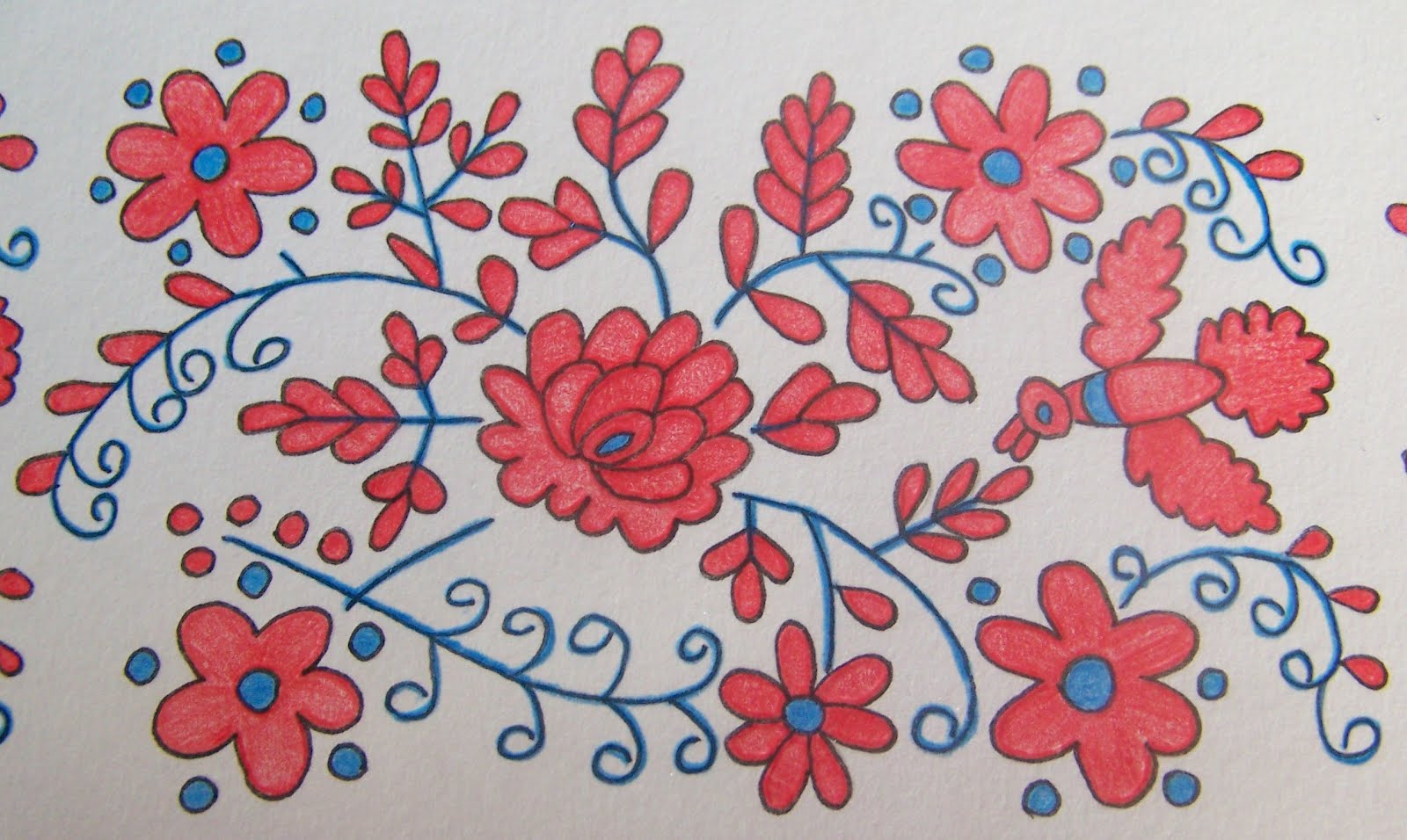
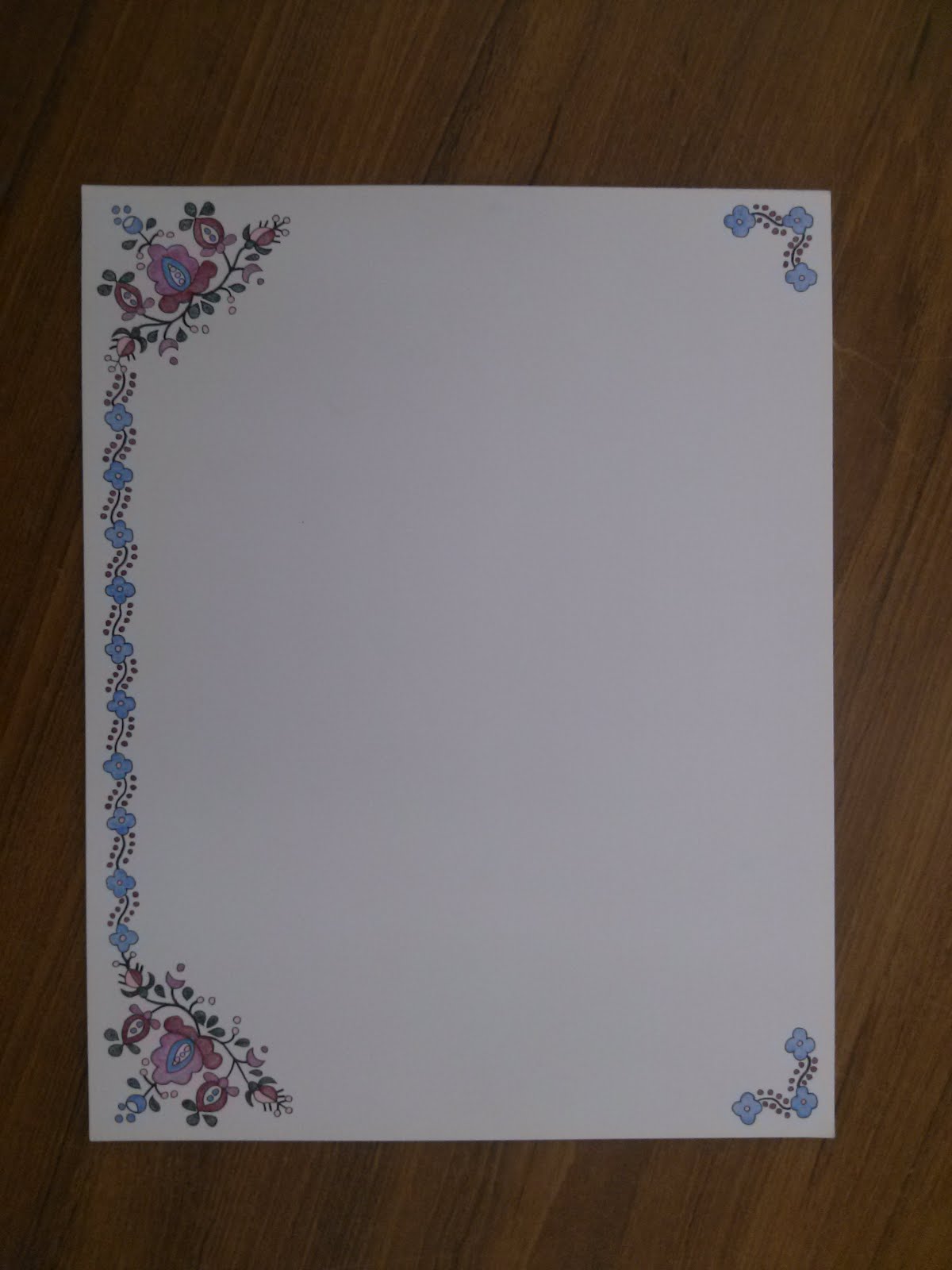
In my past projects, I had trouble working out how to adapt patterns to my ideas, or resizing them (it's true. It didn't occur to me to use a photocopier to resize). This really limited my ability to create something. The design element had to be the right size, in the right place, for it to work. This was why I had fallen back on frames for my second and third project--they were easy to adapt, and, frankly, didn't cause me headaches. I don't know what happened, but I started looking at designs, and going "if I shrink this, I can use that element without a problem." I was now able to use more design elements on a sheet, and still have sufficient space to write. Of course, this being Hungarian embroidery based, I am still restricted to using elements from one region on one sheet. In other words, I can't mix a Sióagárdi element with a Kalocsai element. This time around, as seems to be turning into tradition, I've picked a Kalocsai design from an apron (no, Hungarian aprons weren't "Kiss the Cook" or some such. Or at least, they weren't traditionally.) Aprons were everyday wear in Hungary, although there were often some retained for more formal occasions, like Sunday Mass. The full pattern for this apron (well, this part) was the design at the base of the sheet, with a "bouquet" of three roses at the top. I chose to use the design at the base, and one of the roses as a header.

It's funny. I don't consider myself intrinsically artistic (far from it), and I couldn't create a design from scratch, but within 30 seconds I can look at an embroidery pattern, and decide not only whether it will suit a project, but also what elements will be used, and how. It's like "This is a nice one. S/He will like this. I'll put that there, and that there." The writing is a whole different story.

The tracing, lining, and colouring, as usual, took me little time. A few hours, in total. Of course, considering my time was mainly spent working on "Panic Mode"(qv.), "Orchids" was worked on when I was unable to continue with "Panic Mode". Once "Panic Mode" was finished and mailed away, I could get down to focusing on the more perplexing aspect of "Orchids": the writing. Previously, I'd gotten away with three texts. But I didn't want to start recycling the texts too soon, so I had to find something. I was hoping to find another traditional greeting/blessing, but wasn't having much luck with that. Thankfully, some people put together a few webpages that contained a lot of greetings, wishes, and the such (here, I'll admit I'm not very poetic, either.)

I found a nice greeting that essentially said "may you always smile, never cry, and always have a happy birthday" (told you I'm not poetic. A translation would have been horrid).


What originally got me interested in calligraphy was illuminated manuscripts. Being a bibliophile and a history buff, it was only a matter of time before I discovered these masterpieces. And I don't know what it is, exactly, but I have a preference for Early and High Middle Ages works (Lindisfarne Gospels, Book of Kells, Képes Krónika, Macclesfield Psalter (although the two latter ones are towards the end of my interest)), as a result, I tend to prefer working with uncial, insular, and Carolingian scripts (and occasionally italic). Gothic, due to how slowly it is written, and its angularity (often causing it to be nearly illegible in its most formal form) is a script I had so far avoided. However, I was worried about writing myself into a corner (yes, that was a bad pun), so I looked at a wider range of scripts.

Every once in a while, I wonder why I have so many books on scripts (I currently have eleven, of which two to four are more studies of historical calligraphy than 'how-to' books), especially since there are really only a few unique scripts (Roman majuscule, Uncial, Insular, Carolingian, Gothic, Italic, and !@#$% Copperplate), and just about everything else is variations of those main types. Of course, these variations come in useful, when one is only found in a single book. I had been hesitating to use Gothic, because of its characteristics, but one of my books had a script called "Cursive Gothic". 'Cursive' only in the sense that it could be written faster than "regular" Gothic. But it suited my purpose: it was a script different from what I had used before, it was legible, and I felt it would be suitable. I'd also realized that since red is a very common colour in the designs, I would have a tendency to write in red ink (so there would be no clash between the writing and the design), but really... Not every project needs to be in red, does it? Out of all the colours in the design, the next most common colour was green. I didn't have an ink that matched the shade of the light green (I'd have to blend inks to do that. Another skill I have yet to learn), so I matched the dark green.

I'm actually happy with this one (and so is she, and that's what's important).

mercredi 14 mars 2012

Something about Hungarians and Peppers...

Hot on the tails of "Switcheroo" was another card. Actually, both were being coloured at the same time, which probably explains the resemblance in method.

Two months after making my first card, I went to Montreal to visit some friends, and while I was there, I showed one its photo. She asked for one, so a few months later, when the time came, I started working on it. At this point, I hadn't quite figured out how to modify the patterns I had so they didn't hog all the space on the page. This is why these two particular cards have such big designs (Switheroo is the other one). Around this time I also bought myself a portfolio, so I could protect the sheets while I worked on them (and avoid bending the corners). Needless to say, I felt like I was becoming a true artist (of course, that's absolute nonsense).

Anyway...

One of my resources where I get the designs from has a sheet, showing 5 different "sorminta", or "row patterns". These are designs that would often be embroidered along the edge of a tableloth, sheet, pillowcase, etc. And their purpose happens to make them easily adaptable for my own purposes, with very little mucking of the design. If you've been reading the blog from the start (or have read the older posts), you'll recall I stated that embroidery and design from Kalocsa ("Kalocsai") is very popular, both in Hungary and internationally. (If this is the first time you read that statement, you'll recall I said it the next time I say it.) As a result, this sheet had two examples of Kalocsai sorminta. Nice colourful flowers, as usual, but with, um, two unusual details. One sorminta had a head of wheat, and the other had peppers. First reaction is something along the lines of "what are those doing there?" But, of course, the flowers, wheat, and peppers have a meaning (red peppers represent strength and vigor. And if you've ever eaten hot Hungarian paprika, you know why).

Around this time it comes to my mind that the staff and students at the schools I work must think I'm really weird for drawing flowers all the time.

The greeting is as usual in Hungarian, and is a traditional greeting sung throughout the Hungarian scout community for someone's birthday. It's another one of the funny-indented cards, but from the looks of it, this one was done on purpose. The text, I find now, is remarkably compact. What I had done, was instead of spacing each line out, was simply stack them on top of each other, meaning that now, there's a huge block of space above and below the writing. Spacing it out (even if only by x-height [the height of the majority of letters]) would have spread out the text a little more, and made it more legible. An excellent example of how spacing matters is between the first and second lines, where no less than three times is there a conflict between ascenders (l and h on the second line) and descenders (y, g, and p on the first lines). Inserting an x-height space, in addition to the space required for ascenders and descenders, would have prevented such a conflict. The script is a form of uncial (I think it's half-uncial), which was prevalent from the 3rd to the 6th century.

And of course, there's a typo.


lundi 12 mars 2012

Switcheroo

Part of the fun in doing my various calligraphy cards, I think, is the fact that few people know they'll be getting one. A few people have expressly requested one, but most recipients have no clue, until they get a photo, or, in this case, it's in their hands.

I had been invited to a friend's eighteenth birthday party, and, well, I had absolutely no idea what to get her (and I hold "your presence is a gift enough" to be a cop-out); so I fell back on the common (well, somewhat common in my family) "make something yourself!" As opposed to most of the cards I'd done so far, the text was one of the first things I had settled on. Both her and I were dancers (well, she still is; I start, and then drop out once the skill required for the dances pass me by. I'm far from being a good dancer), and the text is (once again) a Hungarian folk greeting, this time from the region of Szék (now Sic, in Transylvania), which is well-known in Hungarian folk-dance circles.

As for the design, I was having trouble finding a nice "centrepiece" design (like in "Out of the Gate"), so I chose to go with a frame design. Here's where "switcheroo" comes in... Originally, I had planned to make one with a design from the Matyó region of northern Hungary, but I was unsure about the colour scheme. So I asked a friend of mine, who's knowledgeable in the various embroidery colour schemes, and her questions (like "which village?" and "which decade?") made me realize that I had picked the wrong region for a sudden-onset project. So I had to go back to the drawing board, and pick a design that I could pull together quickly. The winner? A border embroidery design from the Palóc region, which, as it happens, borders on the Matyó region! Right next door, and yet, so different. From a multitude of colours and shades, to two: red and blue. Once I knew what shades I needed, things could progress.


By this time, the party had come and gone. So much for a deadline.

But my sister (who makes cards), and I (who, apparently, does calligraphy) teamed up to provide a hand-made and hand-written card.

Of course, there was no hint that the "real" gift was forthcoming.

When I finished it, and gave it to her at a scout leaders' conference (yes, another scout...), the others were ribbing her that since it was so delayed, she shouldn't accept it. And I actually had to say "aren't you going to unwrap it?"...

I don't know if I've mentionned it before, but it usually takes me two days to write a card (in addition to the time spent working on the design). The first evening is a draft, measuring, making sure the writing will fit in the space set aside for it, and seeing how the lines will line up. Basically, making sure that everything will be perfect when the time comes to make the final write-up.

OK. Here's where I totally, and I mean, totally ruin the card for my friend. (Actually, I'm expecting a message asking "you gave me this CRAP?!" after she reads this. If she reads the blog, that is. There's a reason I don't name names.)

This is due to a number of factors that would have been discovered, and resolved, had I not decided to make a card on short notice.

Do I regret making the card for my friend? Absolutely not. Do I regret not having done a better job of it? Absolutely.

I'm disappointed with the way the lines didn't line up evenly: I "solved" this by making all the lines indent, but they don't even indent evenly! I'm disappointed with how crowded it is. Just because you can fill most of the white space, doesn't mean you should. Keep an eye out for when you need to refill the nib, so you don't have words in the middle of the line looking like they're in bold. And if one of your lines ends up being a different size than the rest, when it shouldn't be, RE-LINE IT!

And, of course, there's a mistake in the last line of the poem. Two, actually.

This is one of those times I go "I'm glad people don't know how easy it is to do calligraphy. If they did, they'd know how bad my stuff is."

dimanche 4 mars 2012

Out of the gate with a bang

Last year, after having done calligraphy on-and-off for some time (mostly off), I got the brilliant idea to make a birthday card for a friend. I don't know where I got the idea to make a card, since I had never done one before, and never a project of this type. I had done bookmarks for my schools four years ago, and three years ago I had begun planning on a huge project--a handwritten Bible, but nothing had come of it (well, not yet, anyway). So this card idea was a radical idea.

The funny thing is that a lot of books on calligraphy have a section on various projects--usually bookmarks,, certificates, and birthday cards. Problem was, I didn't like the format these cards have, and I was looking for something that would represent a common link we had (we're both Hungarians). I decided I would create my own format--something that would allow me to showcase calligraphy, and still be able to personnalise it. While going through the embroidery pattern books we had at home, I found this pattern from Kalocsa I loved. It was a pattern for a tablecloth or runner, and at each end was a bouquet of flowers. I loved how this bouquet of diverse flowers blossomed out of a large centrepiece rose. The flowers were coloured with coloured pencils, in a way that would (attempt to) resemble embroidery thread, to give the impression the flowers had been embroidered onto the sheet.

The border is a well-known Hungarian folk greeting/blessing song, usually sung at birthdays by Hungarian scouts (another common link), and was written in a Cancelleresca script, in blue, so as not to clash with the blue cornflowers, and the main greeting was written in a flourished italic script, in red, to tie in with the rose. Of course, I'm not entirely satisfied with the result. The border script wasn't calculated out precisely, and as a result I ended up writing the song one-and-a-half times around the edge, and I hadn't spaced out the lines of the main greeting correctly, giving a cramped look.

However, I did manage to salvage the capital B. That scared me, right at the beginning of the final calligraphy.

All in all, for a first try, pretty good!

This is what I can remember a year after the fact...

lundi 27 février 2012

Not quite calligraphy... (OK, fine, not calligraphy at all)

As I may have mentionned previously, my mom has a particular affection for the embroidery of the region of Kalocsa, in southern Hungary (this has nothing to do with her cultural heritage--she's French-Canadian). She's expressed a desire for some years to have "pingálás" done in the basement, and to this end, for the past year or so, we've had a blank wall at the base of the basement staircase. However, this Christmas, everything fell into place, and my brother, his girlfriend, my sister and I finally got together and made her a pingálás.

Pingálás is an art form that, as far as I know, is specific to, and a particularity of, the Kalocsa region. It is the painting of flowers on just about any surface available, in a slightly different visual form than what is done in embroidery (and therefore different than what I do in calligraphy). I'll freely admit that I know very little about the art form, so I'll shut up before I say something that is just plain wrong. What I can say, is that the visual effect is beautiful and stunning and overwhelming (they paint the walls, they paint the hearths... Heck, if it's a flat surface, they'll paint it!) Since none of us have any base in pingálás, we just went ahead and painted; I went with my usual method, of attempting to replicate the impression of it being made of embroidery thread.

Since my brother and his girlfriend live outside Québec City, they didn't have the luxury of time in which to work. As a result, they both did drew the design. Mom has a book on pingálás, and my brother selected three elements from a particular image: the rose, the blue flowers (I'm not quite certain as to what they are supposed to be) and the fern-like branches. Stéphane (my brother) and Marie scaled the flowers up into a larger size, and then traced them onto the wall. Lianne (my sister) and I then got to work painting them. We initially had a slight difference of opinion on how they should be painted, as we were approaching them differently, but this was resolved by Lianne painting the blue flowers, and I the roses. As I split my time between Burlington and Oshawa, I only had a few days per week to actually paint, so Lianne was done much sooner than I (and yes, I was also procrastinating slightly). Once I was done with my roses, I also took some fine-point Sharpie markers (yeah, real fancy art tools), and lined the design, so that by separating the different colours, the design would be more defined and striking (apparently it does have this effect of bringing out the colours more).

It looks minimal as it is, and it is, but as Mom talks about it, this is only "Phase I"; it will apparently be expanded and embellished over time.

The Christmas gift that keeps on giving, what...!


mercredi 22 février 2012

Panic Mode Redux

(Well, it wasn't really a panic mode, more of an "aw, geez"...)

Monday night I finished one of my projects-in-progress (the one written about in "Panic mode" previously). It took me about an hour and a half to write up, and like usual, it didn't go flawlessly.

First, I decided to take the last line of the writing (where I write "Happy birthday, Edina! God Bless you with a long life!", a traditional Hungarian birthday wish), and instead of keeping it at a total height of 7.5 mm, I upsized my nib, giving me a height of 15mm--double the size. What this does, is screw up my calculations a bit. Of course, since I'm the type of guy who needs to take his socks off to count to twenty, I simply couldn't adjust the calculations, I had to recalculate. (Actually, that's not entirely true. I adjusted, but doubted my math, so I recalculated the whole thing. Which gave me the same result as my adjustment. "Measure twice, cut once", anyone?) Of course, at this time I should have taken a break, taken out a sheet, and written that line at the height it was going to be. But I didn't. I wanted to finish this, before my show came on. (Yeah, I got lazy. Right then.)

This is when I have to mark the sheet, so I have my x-heights, ascenders, and descenders. (I've defined x-height before; ascenders are the parts of a letter that go above the x-height, like the stem of a b, d, l; descenders are the stems that go below the baseline: the stems of j, y, p, q...) I often get slightly frustrated at this point. I'm using .5 mm pencil leads, and I have to mark a line at 2.5 mm, and I'm marking with the full knowledge that variance from that .5 mm will actually give a marked difference in the size of a letter. It's actually quite surprising to see the difference between a letter that's 2 and 2.5 mm tall; the difference is noticeable. (Back to marking...) For some odd reason, when I "tick" my paper, to mark where my various lines are to go, I don't seem to tick on the horizontal, but rather, in an upward direction. So not only is my mark thick, but I also don't have a "stable" point from which to line.

One tool I've picked up, and which I use on all my projects to line, is a pounce wheel. This is a small wheel, that has "teeth" on it, that allows me to rule straight lines (when used with a straightedge, of course). Two things I've now learned with this thing:
  1. Push the wheel to make the line, not pull. Pushing the wheel into the straightedge keeps it firmly against the straightedge, and rules a straight line. Pulling it, well, it always veers away from the straightedge, and the line is no longer in any way straight. It's like the wheel goes "I'm going over here, now. Thanks for lunch."
  2. The indentations produced by a pounce wheel are big enough for a Speecball C6 nib to catch on. I'm using a C6 nib, which is .5 mm wide, and wouldn't you know it, wherever the ruled line crosses my stroke, the nib catches in the dimple, and I have to be very careful about how I then pull the pen. I limit my use of pencil for ruled lines for two reasons:
  • Depending on the pencil hardness, it can be very difficult to erase it, without leaving a tell-tale trace that I needed lines to write so nicely uniform and straight. And
  • Even if I'm able to erase the line without leaving a trace, the ink actually seals the ink into the paper, leaving a nice uniform line at the top and bottom of the letters. This is even more obvious than the line traces...
So I've ruled my lines, I'm writing, and I'm being gingerly (and cursing under my breath at the nib catching in the dimples), and manage to finish with something which (thankfully) resembles Cancelleresca script.

All that's left is that final line, that I decided to resize just as I'm about to start to write, and because of its size, I'm actually able to write it in a beautiful Cancelleresca; this was flawless... except for the fact that I've extended the ascender for the 't' too high (problem solved by scraping off the top layer of paper that contained the ink), and being unsure of how long this line was going to be, I start the line as far left as I can. And the line ends halfway across the sheet. It's like someone took those last two lines, and just pushed them two inches to the left, off-centre.

My friend's thrilled with the result, everyone else that's seen it is impressed, and I'm settling for it. I'm not satisfied with it (I actually have yet to be satisfied with any of my projects. They all have something I could have done better). Not by a long shot. But I don't have the time with which to redo a completely flawless second attempt.

"Good enough" is never good enough.

mardi 21 février 2012

What the hell does that name mean?!

Just a short post to keep the ball rolling... Was out skiing in Quebec, Sunday, and ended up nicely dehydrated, and yesterday I was finishing a project (the Panic mode one--more on that later)

Most of the people reading this are my friends (good lord, I hope that plural is correct!), and by extension, are for the most part Hungarian. so the first part needs no explanation. But there are some who don't speak (or read) Hungarian, so an explanation of the name is in order (as is a pronunciation guide). 'Gyurika', is first and foremost, a diminutive of a diminutive of 'George' (or 'Georges', in this case). So it's like saying "little Georgie". It's a name that's stuck with me, so, yes, I have assumed its use, and promote it (mainly with the scouts, where it's probably one of the names I'm most recognized by, and gives me an easy means of differentiating between the multitude of Georges that are in the association...) It also wasn't only the Hungarians that used it, but also my extended (French-Canadian) family, as well as the kids on the street where I grew up. And each altered its pronunciation to suit its abilities... While it's pronounced something close to "Dyooreeka" (it's always fun to attempt transcriptions of Hungarian into English, especially without using IPA...), my family would pronounce it "Zhurika", and the kids would call me "Julika". So yeah, Gyurika is a name I use, and am known by...

As for the scribbles? It's multifaceted... On one side, it refers to what these posts are... They're at their simplest me scribbling down my thoughts on calligraphy, and more precisely my projects. On another hand, it's my response to peoples' reaction to my work (did that make sense?) Other see the end product, and they tend to react with "wow! That's impressive! What an artist!" My response is generally "I'm not an artist. I just scribble." There's so much I haven't mastered in either the graphic aspects, or the calligraphic aspects, that to call myself an artist would be preposterous. Picasso was an artist. Donald Jackson is an artist (he's Her Majesty's calligrapher). Hell, Jackson Pollock was an artist! I'm very, very, far from that.

I just scribble.

vendredi 17 février 2012

"Speak White": The Project

The funny thing about doing "Speak White" as a calligraphy project, was that while the basic concept was simple enough, the devil was in the details. With a title like "Speak White", it was obvious (kitschy?) that it would have to be written in white. This dictated that the background could not be white, or a light colour. And what could be a more evident choice than black? So, white ink, on a black board.


But should the whole thing be in monochrome? A huge poem, only in white and black? Probably a touch boring. Something had to give it some colour (pardon the pun)... Since the poem is to a certain point bilingual, the other language should be another colour. But which one? Since the poem is called "Speak white", should that be in white, and the rest of the poem in another colour? Since "speak white" is in English, should all the English be in white? A lot of mental tweaking of the visual aspects took place. In the end, I decided that the French text, as the majority of the poem, would be in white, and the English (including "speak white", ironically), would be in red.


Next came the hands. What script to use? I had seen a wonderful NFB filming of Michèle Lalonde reading Speak White in 1970 (I get goosebumps everytime I watch her reading it, I'll be honest), and originally, I was thinking of keeping the red-white colour scheme, but varying the scripts depending on her tone of voice; a softer, more italic style when her voice was quiet, a gothic script when her voice was loud, aggressive. But how many scripts? Where do you decide that her tone went from soft to assertive, from assertive to aggressive? I was worried that the whole thing would just end up devolving into something along the lines of "look how many styles I can write!" So in the end, I went with a design that turned out being striking in its simplicity. French text in a white half-uncial script, English text in a red early gothic script. Of course, that would be too simple; there had to be hiccups. There are terms in French in half-uncial, but red, and English text in white early gothic. My reasoning was that the terms, while in French, represent English terms and concepts, and the French gothic is an answer, by the (Francophone) narrator, to an English question.


Oddly enough, even though I thought that the gothic script would be difficult to read, the half uncial turned out to be more difficult. Not because the letterforms were difficult (they're remarkably clear and easy to read), but because for some weird reason, I decided to go with what is called a "long s". The form for that letter we now use is called a "short s"; the "long s" looked like an 'f', and it, well, stopped the flow of the eye over the poem, since with every word where the long 's' appeared, and your brain had to go "oh, right, that's an 's', not an 'f'..."


I didn't realize how big this was going to be, until I made my calculations. The full size of the boards is 1.6 m. I seem to recall starting to laugh in the staff room at work, when I realized how big this was going to turn out. To get the whole poem to fit on one board, I had to buy a 32"x40" board, cut it lenghtwise, and write it vertically, then attach the boards together, to make a single 20"x64" board. To make it portable, I attached the two boards using hinging tape, which allows me to carry the whole thing folded in half. This had the added effect of a double-whammy when I showed it to classes. The kids would see a big black board, covered in red and white fancy writing, then I would flick my wrist, and the bottom board would swing out, to a second, more stunned "whoa!" (I hope my memory isn't exaggerating).


I expected this thing to take a long time to do, which was why I had started it over Christmas holidays, but it turned out only taking four hours. I'd be writing about 3-4 hours per day, and I was surprised at how "little" time it took me to do (which encourages me with two other projects I have planned).


This was a great project to do early on, since I learned a lot... Would I do it again? Absolutely. I know it would take me less time than I think; I've learned to test how coloured ink contrasts on a non-white background (I thought the striking red would stand out more, and that it would be the white that would be problematic. Turns out it was the other way around). I've learned to check to make sure the longest line fits in the space I've planned for it. And check the bloody alphabet, to make sure it's legible!

"Speak White": The Poem

This one's going to look wordy, but really it isn't. After all, it's just the same poem twice...
Michèle Lalonde
Speak white
Speak white
il est si beau de vous entendre
parler de Paradise Lost
ou du profil gracieux et anonyme qui tremble dans les sonnets de Shakespeare
nous sommes un peuple inculte et bègue
mais ne sommes pas sourds au génie d'une langue
parlez avec l'accent de Milton et Byron et Shelley et Keats
speak white
et pardonnez-nous de n'avoir pour réponse
que les chants rauques de nos ancêtres
et le chagrin de Nelligan
speak white
parlez de choses et d'autres
parlez-nous de la Grande Charte
ou du monument à Lincoln
du charme gris de la Tamise
de l'eau rose du Potomac
parlez-nous de vos traditions
nous sommes un peuple peu brillant
mais fort capable d'apprécier
toute l'importance des crumpets
ou du Boston Tea Party
mais quand vous really speak white
quand vous get down to brass tacks
pour parler du gracious living
et parler du standard de vie
et de la Grande Société
un peu plus fort alors speak white
haussez vos voix de contremaîtres
nous sommes un peu durs d'oreille
nous vivons trop près des machines
et n'entendons que notre souffle au-dessus des outils
speak white and loud
qu'on vous entende
de Saint-Henri à Saint-Domingue
oui quelle admirable langue
pour embaucher
donner des ordres
fixer l'heure de la mort à l'ouvrage
et de la pause qui rafraîchit
et ravigote le dollar
speak white
tell us that God is a great big shot
and that we're paid to trust him
speak white
parlez-nous production profits et pourcentages
speak white
c'est une langue riche
pour acheter
mais pour se vendre
mais pour se vendre à perte d'âme
mais pour se vendre
ah !
speak white
big deal
mais pour vous dire
l'éternité d'un jour de grève
pour raconter
une vie de peuple-concierge
mais pour rentrer chez nous le soir
à l'heure où le soleil s'en vient crever au-dessus des ruelles
mais pour vous dire oui que le soleil se couche oui
chaque jour de nos vies à l'est de vos empires
rien ne vaut une langue à jurons
notre parlure pas très propre
tachée de cambouis et d'huile
speak white
soyez à l'aise dans vos mots
nous sommes un peuple rancunier
mais ne reprochons à personne
d'avoir le monopole
de la correction de langage
dans la langue douce de Shakespeare
avec l'accent de Longfellow
parlez un français pur et atrocement blanc
comme au Viêt-Nam au Congo
parlez un allemand impeccable
une étoile jaune entre les dents
parlez russe parlez rappel à l'ordre parlez répression
speak white
c'est une langue universelle
nous sommes nés pour la comprendre
avec ses mots lacrymogènes
avec ses mots matraques
speak white
tell us again about Freedom and Democracy
nous savons que liberté est un mot noir
comme la misère est nègre
et comme le sang se mêle à la poussière des rues d'Alger ou de Little Rock
speak white
de Westminster à Washington relayez-vous
speak white comme à Wall Street
white comme à Watts
be civilized
et comprenez notre parler de circonstance
quand vous nous demandez poliment
how do you do
et nous entendez vous répondre
we're doing all right
we're doing fine
we
are not alone
nous savons
que nous ne sommes pas seuls.

And for those of us who don't speak French fluently, here is an English translation. Not as poetic as other versions I've seen, but more faithful to the text of the original... Portions in italics are in English in the original.

Michèle Lalonde
Speak White

Speak white

it is so nice to hear you
speak of Paradise Lost
and of the gracious and anonymous profile that trembles in Shakespeare's sonnets

we're an uncultured and stammering race

but we are not deaf to the genius of a language
speak with the accent of Milton and Byron and Shelley and Keats
speak white
and forgive us for only having as an answer
the raucous songs of our ancestors
and Nelligan's sorrows

speak white

talk about this and that
tell us about the Magna Carta
or the Lincoln Memorial
the grey charm of the Thames
the pink waters of the Potomac
tell us about your traditions
we don't really shine as a people
but we're quite capable of appreciating
all the significance of crumpets
or of the Boston Tea Party

but when you really speak white

when you get down to brass tacks

to talk about gracious living

and speak of the standard of living
and of the Great Society
a bit louder then speak white
raise your foremen's voices
we're a bit hard of hearing
we live too close to the machines
and we hear only the sound of our breath over the tools.

speak white and loud

let us hear you
from Saint-Henri to Saint-Domingue
yes what an admirable tongue
for hiring
giving orders
setting the time for working yourself to death
and for the break that refreshes
and invigorates the dollar

speak white

tell us that God is a great big shot
and that we're paid to trust him
speak white
talk to us of production profits and percentages
speak white
it's a rich langauge
for buying
but for selling oneself
but for selling your soul
but for selling oneself

ah!

speak white
big deal
but to tell you about
the eternity of a day on strike
to tell the story of
a life of a servant-people
but for us to come home at night
at the time that the sun snuffs itself out over the backstreets
but to tell you yes that the sun is setting yes
every day of our lives to the east of your empires
there's nothing to match a language of swearwords
our none-too-clean talking
greasy and oil-stained.

speak white

be easy in your words
we're a race that holds grudges
but we do not criticize anyone
for having a monopoly
on correcting language

in Shakespeare's soft tongue

with Longfellow's accent
speak a pure and atrociously white French
like in Vietnam in the Congo
speak impeccable German
a yellow star between your teeth
speak Russian speak call to order speak repression
speak white
it is a universal language
we were born to understand it
with its teargas words
with its nightstick words

speak white

tell us again about Freedom and Democracy
we know that liberty is a black word
just as poverty is black
and just as blood mixes with dust in the steets of Algiers and Little Rock

speak white

from Westminster to Washington take it in turn
speak white like on Wall Street
white like in Watts
be civilized
and understand our make-do talking
when you ask us politely
how do you do
and you hear us say
we're doing all right
we're doing fine
we
are not alone

we know

that we are not alone


No pic this time, but a few next time.

jeudi 16 février 2012

"Speak White" intro

Last May/June, I started doing calligraphy with the grade 8s at one of my schools. I showed them one project, a few ideas I had for other projects, and they all had one overwhelming point in common: the language of the writing was Hungarian. This was kindly pointed out to me by a student, who stated that she would "have to learn Hungarian, so [she] could understand [my] calligraphy." She was dead on, and I realized that I knew considerably more Hungarian poetry than Francophone (or, more precisely, French-Canadian) poetry. So I start looking for poetry, but I realize I'm shooting in the dark; I don't know who I'm looking for, I don't know what I'm looking for. I don't know how I came across it, and as corny as it sounds, it's like it found me. I read it once, and just went "Yes. This will be the one." The poem's called "Speak White", and was written by Michèle Lalonde back in 1968.

I don't know how to explain the premise of the poem, but I'll try. As recently as a few decades ago, the French-Canadian community was looked down upon quite a bit. 'Speak White' was a common slur, used by English-Canadians, to tell Francophones to speak English. (My late grandfather, though being French-Canadian, and living in a mainly French-Canadian town, had to attend school in English, because teaching in French was made illegal by the Government of Ontario in 1912, with the exception of religion and French classes; the law was only repealed in 1927, and it wasn't until 1968 that French-language schools were officially recognized in Ontario).

The poem, as I read it, is a voice of protest against this attitude of superiority of a culture that believed itself to be a bringer of civilization, and had an empire. And we're not just talking about the British Commonwealth, which had given up its 'Empire' only 20 years previously, but also the U.S., which at the time was heavily involved in Vietnam (the Tet Offensive was earlier that year). And also against other regimes that were oppressive--U.S. Segregation in the South (Little Rock was only 14 years previous, and Martin Luther King had been assassinated earlier that year); French and Belgian control of Vietnam, Algeria and the Congo; The Soviet Union's satellite states; Germany's attempted extermination of the Jews. The poem ends on a note of solidarity, that though their circumstances are different, the repressed peoples of the world have each other. As the last lines read, "we know / that we are not alone."

mardi 14 février 2012

Panic mode

So, like I said, I'm currently working on five projects, in various stages of completion (One is ready to be scribed, one is lacking a detail in the design before I scribe it, two need to have the designs done, and one is just puzzling me. More on that one later).

I actually don't have any of my projects with me (except for one. More on that one later, too). Since I make them as gifts, they have this nasty tendency to go live in other cities. The first one I did (image in the preceding post) is currently in Vienna, Austria; the second one I made is in Aurora, Ontario, and the third is in Laval, Québec.

The one I'm currently working on will make its way to western Hungary, and as much as I'd like for it to be there in mid-March, that just may be a bit over-optimistic.

I do things backwards. By backwards I mean I don't follow the "accepted" order of writing and decoration, as done in medieval illuminated manuscripts. Those works of art were written first, then decorated. And usually not by the same person. I do it backwards--I decorate it, then scribe in whatever it is I want to write--making the writing conform to the limitations imposed by the decoration, whether it be a centrepiece, or a border. On my current project, I've chosen to go with a border only on the left of the board, with small corner decorations in the other two corners.


A note on the design: Most, if not all, of my designs are based on traditional Hungarian folk designs (OK, I lied--I trace them; I'm not good enough to create my own designs). The left border is an element from a tablecloth embroidery from the region of Sióagárd, in West-Central Hungary, and the corner elements are napkin embroidery that go with the tablecloth.

At this point, all I have left is scribing what I want to write. In this case, it's the lyrics to a well-known Hungarian "happy birthday" song.

Here's where panic starts to set in.

I hadn't yet chosen a font, and even though I'm particularly fond of post-Roman and pre-Gothic hands (i.e., uncial, insular, carolingian, etc.), I felt that these hands wouldn't be quite suited to a modern, upbeat song, so I went in search of something more modern, and I settled on a Cancelleresca hand. I then calculated how much space the writing would need for a particular nib size--and to get the whole thing to fit on the board, the x-height (the height of letters like a, e, o, x, etc.) would be 2.5 mm. I found this to be ridiculously small, so I decided to go something that had a little more 'weight' to it--so back to an uncial hand I go, and enlarge the size of the font slightly (x-height: 6mm). The board is now lined for a draft of the scribing, and as I write, I realize that there is simply no way I can get a whole line of the lyric on one of my lines. So I reduce the size of the hand (to 3 mm), and realize that hey, this isn't actually that small.

Result: Not even one line written, a $2 sheet of Bristol vellum which is now scrap paper, and we're back where we started--with Cancelleresca.

Problem is, I don't even know how I could have planned this out more effectively. I probably would have had to attempt writing it in any case.

But at least I know that 2.5 mm is not too small, especially when the ascenders and descenders of the letters are going to be 5 mm each (the 'f' will be close to a whopping 7.5 mm!)

So, yeah, panic for nothing. Welcome to my world.

By way of introduction (or, I have no idea what I'm doing)

I really don't know what to write, so I'll just write, and hopefully something turns out...

And hopefully this blog doesn't turn out to be a false start like the last one.

Right, so, by way of introduction. --

I've been practicing calligraphy for the past year, and whenever someone sees the end result, the reaction tends to be favourable, usually with the questions of "did you do it yourself?", and "how do you do it?" And a friend suggested I create a blog. So, after resisting, and reflecting on the idea, I got sucked in and decided to start another blog. (This'll probably be more of a journal than anything; I can't imagine anyone actually taking the time to read this.)

I don't know when I got seriously interested in calligraphy ("seriously" is probably an exaggeration), but I've been interested in books from my youngest childhood (we have a family story about me being attracted to books at my first Christmas), and coupled with an interest in history, it probably wasn't a far stretch to get interested in medieval manuscripts. My first "major" project was done four years ago when I made bookmarks for two schools I was working at. In total, 68 double-sided bookmarks, with an image of a literary character from books that were in the libraries, and quotes about books, reading, writing, and libraries, in different colours and different scripts. All in all, a month of work (with a recent break-up as an inducement to really dive into the work), and within a half-hour of being in the kids' hands, they were being folded. Four years later, they're starting to look sad. I'm starting to think about replacing them for next year.

So last year I began "seriously" doing calligraphy (ok, "seriously" is really an exaggeration here) with a birthday "card" (it's 11"x14", for Pete's sake!) for a friend. As a result, I made two more, and I'm currently in various stages of working on five. And this is probably where I should stop this post, before everything gets even more muddled together than it already is.


This is the project that got *this* ball rolling.