mardi 8 octobre 2013

Whistles

I think I've mentioned  before that I'm involved in Hungarian scouting.  Which means that while I am a scout leader, I do my scouting in Hungarian.  In Canada, or in the northern US, as the case may be.  Which is confusing at the best of times (I usually end up giving US Customs a history lecture, when I try to explain how I, a Canadian, am heading to the States, to do scouting.  In Hungarian.  A friend of mine has advised me "don't call it 'Scouts', it just confuses the hell out of everybody; call it a 'diaspora youth group.' Makes more sense.")

Now that I've gotten that out of the way, every year, at the end of September, there's a camp whose theme changes every year, but always has something to do with Hungarian folk culture.  Last year, the theme was the Csángó of Moldavia, a Hungarian population that has lived in isolation from the remainder of Hungarians for a few centuries now, to the point that among other things, their dance styles hadn't evolved with time ("old-style" group dances, as opposed to "new-style" couples' dances; because, hey, who doesn't like dancing?).

I was contacted by a friend who was one of the organizers for this camp, and she asked me to design the camp souvenir.  We have little souvenirs we can hang from our neckerchief woggles, and some scouts' woggles become so decorated with souvenirs, aide-mémoires of various sorts, etc., that they're referred to as "Christmas trees".  Anyway, she had an idea she wanted me to do--a souvenir based on a traditional type of flute, called a 'kaval'.  A kaval is a flute that is open at both ends, is end blown, and in Csángó folk music, is hummed into, as it is blown, creating a sort of drone, along with the flute's 'whistle'.


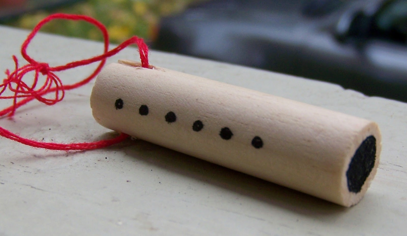
That was all I had to work with, really:  "make it so it looks like a kaval."  Everything else was up to me.  Unfortunately, I didn't have time that week to work on the design, but I had an idea of how I wanted it to come together, how it would look.  My original prototype had a mocked, black-markered mouthpiece at one end, and only five holes.  The final result was more like a real kaval, with "holes" at both ends, and six "holes" for melodies (all drawn, of course; they would have been much more authentic, but much too fragile had I attempted to actually make real holes...).

I had to make about forty or so of these souvenirs, which took me nearly the entirety of the first day of camp.  Dowel rods had to be cut, coloured, and lanyard holes drilled, before I could scribe them.  That was the hard part:  not only having to use a pen-nib on a rounded surface, but wood, at that!  Every once in a while, whether it be from the nib being too full of ink, or whether the wood grain happened to be more absorbent at spots, some of the letters were more, well, blobs, than actual letters.  I decided to go with an Uncial script, for no other reason than it felt right.  And it would be easier to write on a rounded wood surface, than, say, Gothic.  I was also afforded one or two creative touches in the lettering:  the Hungarian alphabet has letters with umlauts ( ö, ü) and "long marks" (ő, ű), and these go over the letters.  However, due to the constraints I had to deal with, I chose to tuck the umlauts of the letter 'Ö' inside.  Thankfully, the word is still readable as "REGÖS", despite the unusual umlaut placement.  Furthermore, instead of writing "REGÖS 2012", I decided to write the year a bit more subtly, and tucked "12" inside the bowl of the letter 'G'.  I doubt there will be confusion as to whether it was Regös 1912, 2012, or 2112.

The souvenirs were very well received.  So well received, in fact, I was asked to do the souvenirs again for this year's camp.  Which, apparently, were very well received.  I think I just excelled myself into a job I can't get out of.


lundi 7 octobre 2013

Phoenix

As a result of having 20 or so projects to be done last year (I work by academic year, apparently--September to June...  Gives me my summers off), and having seen how long it took me to do my projects last year, I was considering dropping a few projects.  I mentioned this train of thought to a friend, and her reaction was "Don't you dare drop [her daughter's], it's her 18th birthday."

So I started looking through my books for something to work from.  I have a decent amount of material on the embroidery of Kalocsa, since it is the most popular style of folk embroidery.  Ironically, this is also why, while I don't dislike it, I try to minimise my use of it.


One result of having such 'standing orders' in regards to cards is that every year, I have to find a way of making each card better than the preceding.  Since my skill level isn't exactly skyrocketing from toddler-scribble to the Hours of Catherine of Cleves (which a) I own a digital facsimile of certain pages of, and b) you really, really, should have a peek at; check Wikipedia or the Morgan Library), it's more on the level of presentation that I have to work.  In the case of this project, it was taking a circular tablecloth pattern, and stretching it out into a hanging banner, and finding another, similar pattern to fill the bottom of the sheet with, lest it look too empty.


Tracing the design, and preparing it for colouring was as usual, a bit time-consuming, but really, no worry.  And this is where the trouble began...


For some reason, I decided not to follow my own instinct and knowledge in how the flowers should be coloured, but decided to try and match the colours in the book with my pencils.  I was half-way through colouring the banner before I stopped, looked at it, went "wait a minute..." ...and noticed that the colours were all wrong.  I don't recall what everything wrong was, but I distinctly remember that the cornflowers, which are light blue, somehow ended up dark, but dark, blue.  Between comparing the book-colours, and laying them on the sheet, the colours were no longer what they should have been.  Unfortunately, as is wont with coloured pencils, I couldn't erase this glaring flaw.  I had to scrap the whole thing, and start from scratch.  Which I did, swearing under my breath of course.


The second time around, despite now having less time in which to finish the project, went smoother than the first time, as I now had a familiarity with the design.  Tracing, lining, and colouring (now trusting my knowledge to the colours I knew, and then adjusting for the ones I needed) went quite quickly.  Scribing went nicely as well, with the exception of what I consider one of my quirky flaws--no matter how centred I set my guide text, I always seem to pull to the left.  The text, as usual, is a simple Hungarian birthday wish, expressing a hope for much happiness, joy, long life, etc., etc.  I'm not translating it.  It would just sound awkward and stilted were I to do that.


Ladies and Gentlemen, may I present to you the Phoenix:  a project reborn of the ashes of its preceding incarnation.