dimanche 15 avril 2012

Embroidery. Just for Men.

So far, all my projects have been made for my lady friends (I know, it's a stilted phrase, but you'll understand). I've been uncertain how to approach my male friends on the idea... "Hey! I made you a card with pretty writing and flowers!" "You're a dork, Georges..." So I was quite pleased when I was talking with one of my friends from New York, when we agreed to an exchange--he would carve me a spoon, I would make him a card. Thankfully, my main resource for the patterns I use for embroidery had a number of designs, from different regions, that would beyond the common colourful patterns Kalocsa, and Palócföld (Kalocsa is a small town in southern Hungary, and Palócföld is a region in northern Hungary, for those who haven't been here since the beginning). There were also a few patterns from what are called "cifraszűr".

Cifraszűr need to be described... These were felt "overcoats", which Hungarian shepherds wore. They were made of felt, and were quite warm (including in the summer, although they weren't unbearably hot). The interesting thing about them, is the embroidery. These were embroidered with wool, not cotton or linen thread. They were also only embroidered by men, the "szűrszabó", which were formed into 'guilds' in the main centres of production. And, as the cifraszűr was found in many different areas of Hungary, while the overall form was the same, with few differences (the sleeves would be long, which was the main type, or they would be short, "stubby" things sown shut with a "plug", and used as pockets. These last forms were more common west of the Tisza river). They would be richly decorated; the back panel, hanging from the shoulders would often be richly decorated, and have rosettes at the corners. The lapels on the front would be decorated, and often stretched to the bottom edge, which would itself be decorated, as would the seam at the back, and the waistline. They were also "closed" with a buckle at chest-height. One of my favourite articles of Hungarian clothing, which I would dearly love to acquire an example of! (Unfortunately, I have been unable to find a usable picture of a cifraszűr. But it's easily Googleable.)


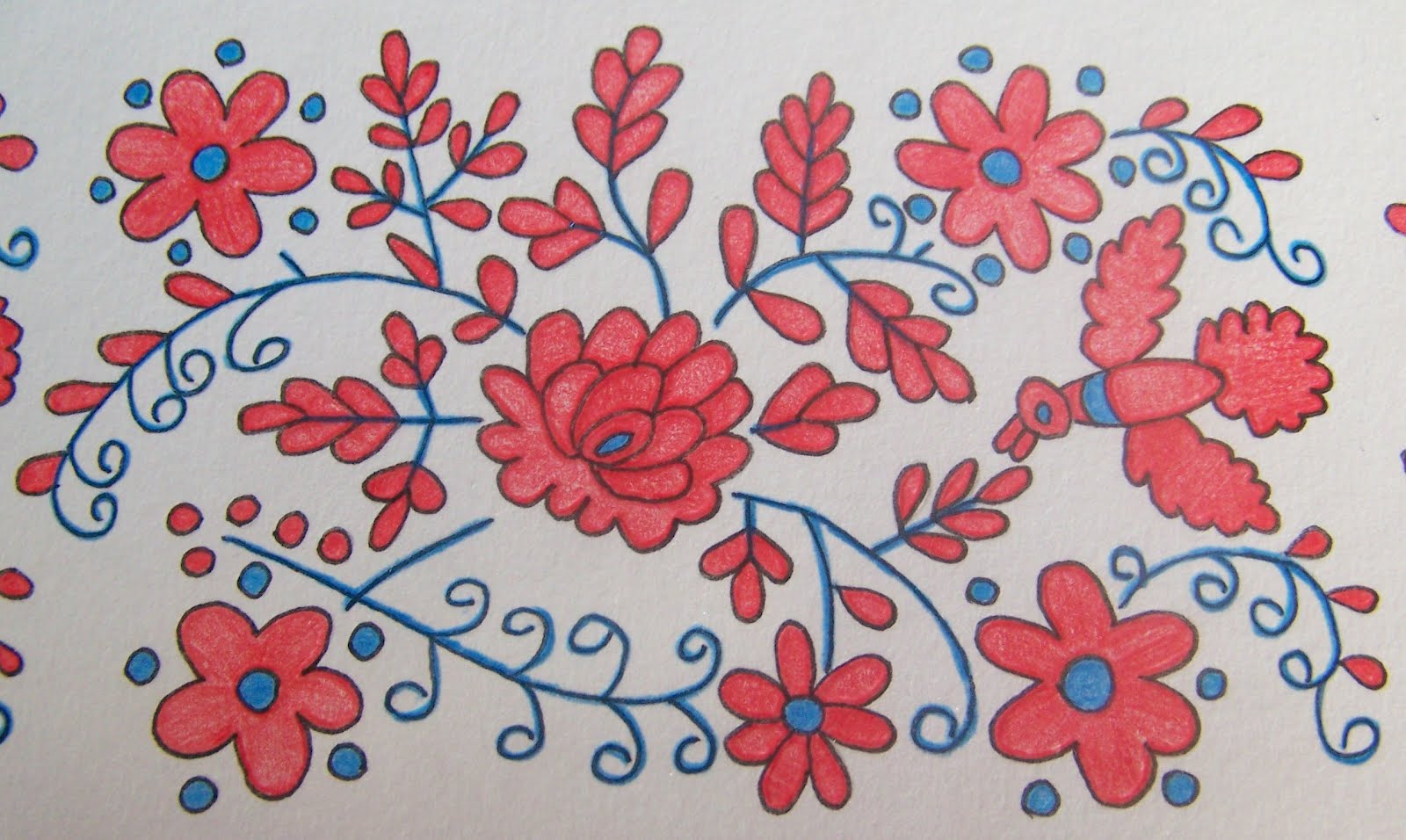
One of the first things I had to do with this project was actually dye the paper. Yes, good old-fashioned tea-dyeing, to give it the look of white felt, which, of course, wasn't "printer-paper white". This had the side-effect of curling the paper, since I had a short time in which to dye it, let it dry, and trace the design, before I left for a visit to Québec City. Thankfully, as a result of storing it in a portfolio, it's now lying quite flat. The colours were an interesting discovery. So far, I'd been able to get away with using plain colours, without having to blend (I definitely don't have an art background...), but the colour scheme for this one was red, pink, and... dark and light "Bordeaux" (which is in itself a dark red). Which meant I had to discover the secret to blending colours. In this case, I think I succeeded quite well.

What surprised me, was the amount of red involved. How red it was. Of course, the colour scheme showed where the red would be, but I've yet to be able to visualize the colours on a blank design. The pink and bordeauxs softened much of the initial shock as to how red it was, but I recall wondering whether I'd made a smart choice in design. And since I was using watercolour pencils for the first time, I didn't realize that they would rub, and I ended up with a nice red glow around the design itself. Which was for the most part subsequently erased, after having shifted my hand and arm position for the remaining colours (touch the paper as little as possible!).


The greeting was another problem. Since this was a birthday card, it had to have the appropriate greetings of goodwill, happiness, etc., etc., but I didn't want something along the lines of "all the stars are dancing for you, because an angel told me it was your birthday". Sometimes I'd think I found one, and then later reread it, and decide against it. Finally, one said (get ready, this will be a horrible translation) "I wish the days of your life will be like the surf of a clear brook". It sounds better in Hungarian.

Early on, I had decided to use a Gothic script for this one (it seemed more "manly" than most of the other scripts I'd used to this point. But certain types of Gothic can be quite difficult to read when written in large amounts, since the excellence of Gothic isn't judged by the individual letter or word, but rather by the appearance of the entire sheet. If the page looks even, equal, nothing standing out, it looks like it was "woven", it's a good example. If there are "holes", or if something stands out, it loses its cohesion. One of my books had an example of Gothic with "spiked" foot serifs, which lent weight to the script. Combining this with my script, it kept it readable, but also accentuated the letters themselves, without taking away from the overall appearance.

He was well pleased. Enough said.

lundi 9 avril 2012

Redbirds

Things seem to have begun panning out. At the beginning of March, while at a weekly scout meet, I was speaking with a few other leaders, when somehow, my calligraphy came up. It may well have been me, saying "have you seen my calligraphy?" (Yes, I know. Very subtle.) One of the leaders turned to me, and asked if I'd consider doing a project for her mother's 75th birthday. And, here's the clincher, I'd be paid for it. Of course, I said yes. A) I get remunerated for a project, and B) word of what I do spreads. Wonderful. By the end of March, we've finalized on the design that will be used, the text, the greeting. (The style of calligraphy, as well as the layout for the project itself, would be left up to me.)

I then started mentally planning the project. All this really means is that I spent a week thinking "I really should get started on that project." I really should get into the habit of drawing rough sketches of what I'm planning. Perhaps that way I'd have less surprises when I actually start.

In retrospect, it was a good thing I'd delayed, so that I could do it over Easter weekend (or I'm rationalizing. Probably rationalizing). Because I was being paid for it (and I had no idea what I should ask for, or expect, so I always brushed it off with "we'll discuss it when I deliver it"), I needed to be able to keep track of how much time was spent working on it, as well as keep from moving it too much, to avoid dog-earing it. One of my main concerns was that at my usual size (11"x14"), with a full frame, there would be very little space for writing, or that the writing would seem to be cramped and tiny, so I opted for a bigger board, which I could subsequently trim to size. However, I have yet to discover all the intricacies of sizing a project from the centre out, and I was trying to figure out a starting point, my mom chimed in with "she's an older lady--she'll have an easier time finding space for a smaller board", which certainly solved that problem. So I had to do it on an 11x14, and work it as best I could.

I was halfway through the first motif (and somewhat horrified at the amount of tracing I would have to do), when I noticed I'd screwed up: There was no way I'd be able to fit a full frame, with writing, so I'd have to cut back on the frame. However, by also starting with the left-hand frame, I'd also ensured that the bottom frame wouldn't fit properly (there wouldn't be sufficient space for two motifs; one motif would be too short; and that one motif would just look like it was stuck on). Off I go to grab another board, draw my edge marks, and start over, with the base first--this allowed the design to look like the base frame was supporting the left-hand frame. Of course, I still managed to screw up just a bit. Instead of starting in the bottom left corner, which would result in a small gap at the ends of both frames, I started in the top-left, meaning that there was no gap in the top-left, but there was one in the bottom-right.

After the tracing, came the "lining" (I'm sure there's a proper term for this, but I don't know what it is), where I go over the pencil with a thin pen. This, to my eye, allows the colours to come out as separate colours, with separate elements, as opposed to blurring together, had the colour been applied directly to the pencil; it gives the colours and elements definition. Once the lining was done (and a coat of fixative applied, so it wouldn't bleed), came the colouring. This part became a bit unusual. My parents had given me a set of coloured pencils for Christmas, but these were watercolour pencils. Meaning that as I sweat over my work (literally), the colours would bleed (I learned this on a project that will be the subject of an upcoming post). So my method turned into touching the sheet as little as possible, and only edge the reds. Then fix. Then fill the reds, then fix. Add the blue, and fix again.


Thankfully the colouring was done, because I was getting a touch loopy from smelling the fixative (I was not sniffing it, but it was in the ambient air...), so I got to take a short break, open the window and let it air, while I went and considered the scribing. A few calculations, and it turned out that instead of nice big letters, these would have to be quite small (of course), but still legible, and the script could still be seen clearly. The longest line, and the greeting, which I tend to do a size bigger (For example, if I write the main body with a 1 mm nib, at three nib-heights=3mm, then the greeting would be 1.5 mm, at 3 nib-heights, 4.5 mm. For those wondering, yes, I use Speedball nibs), still fit in the space allocated, which is one of my main panics at this stage. And to make it more impressive, instead of simply writing it with a right margin, I indented each subsequent verse, giving a descending-stairway appearance, which worked out quite nicely.

I was quite surprised to find that I'd spent 9.5 hours working on this. I didn't think my projects took so long, especially since on many of them, I would also work on them on my lunch breaks. And 9.5 was only the time spent sitting in front of the board. If I included all the time spent looking at various designs, and shortlisting the ones that would be best suited, as well as looking through my scripts, and doing various arithmetic, it would probably be closer to 12...

And here's the technical description! The design is a Palóc apron design from the town of Varsány, in northern Hungary (Palóc embroidery is renowned for its use of red and blue), and the script is in Bâtarde, which, combined features of Gothic script, with French Secretary hands--hence its appellation. It was used in the 15th and 16th centuries.