jeudi 29 mars 2012

Les fameux signets (The famed bookmarks)

Back in 2007, I was hired by the Toronto-area francophone public school board as a library technician at two schools, for a one-year contract. I'll admit I didn't do much. I didn't start any major projects, I didn't put into place any radical changes in the manner the libraries were run, because to my mind, they weren't "my" libraries, and I had no business changing anything. I was simply "holding the fort" for the permanent technician, who was due to return the next year.

One thing I did change, however, were the bookmarks the kids were using. These bookmarks were big, because their job was to hold the place of a book on the shelves, while the kids looked at them, and decided whether they wanted to borrow that particular book. And since these were elementary schools, some of the books were big, and so the bookmarks were just as oversized. They were over a foot long, and about an inch-and-a-half, two inches wide. But they were beaten up. Boy, were they beaten up. They were torn, creased, folded in two, and in some cases, as the lamination split apart, so did the paper. They also lacked something that said "This is the library!" One school's was simply numbered. Blank bookmarks, with a number on one end. And believe it or not, the kids actually found numbers to fight over. Seriously. You would have a kid whining "I wanted 34!", and another kid gloating that they were the best, because *they* got 34. At the other school, it had been one of the classes that had drawn them, with the resulting variability in designs... The boys didn't want the bookmarks that had rainbows and flowers, and the girls didn't want the ones that had guns and explosions (Really. At least one bookmark (I remember one clearly) had a number of small guns drawn with markers, along with starbursts explosions). These had been drawn by those that were then in grade 8, when they had been in grade 3. So they'd had five years of abuse, by at least four classes a year.

So I'd decided that I'd leave my mark in a way that was unobtrusive, but still unavoidable--I'd make both schools new bookmarks.


The idea was simple enough. Make bookmarks that clearly say "this is the library". Each bookmark was to have a quote written on it, on the topic of books, reading, writing, or the library. The quotes were mainly from francophone, primarily French, authors, although there were some German, Dutch, and English authors thrown in. As well as Groucho Marx. Due to the size of the classes, I had to make a large number of bookmarks (Thirty-four), which meant that I had to make 68 bookmarks (one set for each school), and find 68 quotes (two for each bookmark, one on each side), as well as images of 34 literary characters. The quotes couldn't be too long, should be understandable (or at least, I should be able to explain them), and the characters had to be from books that were contained in the library (and preferably by francophone authors).

It took me about two months to write up all the bookmarks, which was not too shabby, since it was tiring, and since this was my first project of this size, I had to deal with complications as they appeared. I had a number of different scripts to pick from, and I used as many as I could, and used a number of different ink colours as well. And mistakes were not uncommon. These I dealt with in the medieval manner: scrape off the ink, and keep going! Nice thing is, since I was using cardstock, these mistakes were sometimes difficult to find.


Finally, around mid-April 2008, I'd finished 68 bookmarks, split them up so each school got a set, and brought them in. I'd spoken about them for so long, and the kids had been asking when the new bookmarks would be in for so long, I decided to have a bit of fun with the "reveal"... The grade 3-4 class came in, sat down, and... waited. I started playing Carl Orff's "O Fortuna", because, really, isn't just the most dramatic choral and orchestral piece around? As the piece started, I picked up a wastebasket, then picked up and tossed in the old bookmarks. When the first "climax" hit (about 15 seconds into the tune), I triumphantly raised up the new bookmarks. The class started cheering, applauding... They were so enthusiastic, a teacher's aide came from the other side of the school scolding as to what all the noise was, since we could be heard on the other side.

I handed out the bookmarks, they marvelled at them, and within 15 seconds, they were being folded.

Oddly enough, the kids didn't believe me when I told them they were all hand-written. It would seem I did such a good job (and, well, who does calligraphy these days?), that they couldn't wrap their heads around it, until I would randomly write the name of one of the kids in various styles, that they would realize "well, geez, he really can write like that!"

They've survived four years of rough usage by the kids, and they'll hopefully be replaced next year, before they fall apart...
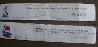


And they're very popular. I'm down to 28 at one school, and I have no idea how many still remain at the other school.

lundi 19 mars 2012

Orchids and gothic (For lack of a better title.)

Thus begins the second year.

Well, OK. I'm about three weeks early in declaring a year of calligraphy, but considering this is the second card I make for my Viennese friend, I'll call it a year.

I'm going to try and not get weepy and retrospective-y, but I'll still talk about the past year to start off. I didn't think, a year ago, that I would be doing this so much. I mean, sure, calligraphy was/is always going to be a hobby, but I never imagined that it would pick up so fast. Granted, the summer was slow (mainly because I was in Hungary for a month--that tends to slow down calligraphic production), but I did complete six projects this past year. Which seems like very little, but four of those were completed within the past three months. Not a bad rate of production. I also did a number of smaller projects (three Christmas cards, and one birthday card. Nothing really special about them). I taught the grade 8s at one of my schools to do a little bit of calligraphy, and will be doing so again. I introduced calligraphy to the grade 9s at my other school, and have been encouraged to launch a calligraphy club at school next year. I created a decent-sized project, and completed it, without too many flaws, in a short time. And I launched this blog, which, if we go by page views, has gotten a bit of exposure (who's reading my blog in Russia and the Ukraine?!)

End sentimentalness.


In my past projects, I had trouble working out how to adapt patterns to my ideas, or resizing them (it's true. It didn't occur to me to use a photocopier to resize). This really limited my ability to create something. The design element had to be the right size, in the right place, for it to work. This was why I had fallen back on frames for my second and third project--they were easy to adapt, and, frankly, didn't cause me headaches. I don't know what happened, but I started looking at designs, and going "if I shrink this, I can use that element without a problem." I was now able to use more design elements on a sheet, and still have sufficient space to write. Of course, this being Hungarian embroidery based, I am still restricted to using elements from one region on one sheet. In other words, I can't mix a Sióagárdi element with a Kalocsai element. This time around, as seems to be turning into tradition, I've picked a Kalocsai design from an apron (no, Hungarian aprons weren't "Kiss the Cook" or some such. Or at least, they weren't traditionally.) Aprons were everyday wear in Hungary, although there were often some retained for more formal occasions, like Sunday Mass. The full pattern for this apron (well, this part) was the design at the base of the sheet, with a "bouquet" of three roses at the top. I chose to use the design at the base, and one of the roses as a header.

It's funny. I don't consider myself intrinsically artistic (far from it), and I couldn't create a design from scratch, but within 30 seconds I can look at an embroidery pattern, and decide not only whether it will suit a project, but also what elements will be used, and how. It's like "This is a nice one. S/He will like this. I'll put that there, and that there." The writing is a whole different story.

The tracing, lining, and colouring, as usual, took me little time. A few hours, in total. Of course, considering my time was mainly spent working on "Panic Mode"(qv.), "Orchids" was worked on when I was unable to continue with "Panic Mode". Once "Panic Mode" was finished and mailed away, I could get down to focusing on the more perplexing aspect of "Orchids": the writing. Previously, I'd gotten away with three texts. But I didn't want to start recycling the texts too soon, so I had to find something. I was hoping to find another traditional greeting/blessing, but wasn't having much luck with that. Thankfully, some people put together a few webpages that contained a lot of greetings, wishes, and the such (here, I'll admit I'm not very poetic, either.)

I found a nice greeting that essentially said "may you always smile, never cry, and always have a happy birthday" (told you I'm not poetic. A translation would have been horrid).


What originally got me interested in calligraphy was illuminated manuscripts. Being a bibliophile and a history buff, it was only a matter of time before I discovered these masterpieces. And I don't know what it is, exactly, but I have a preference for Early and High Middle Ages works (Lindisfarne Gospels, Book of Kells, Képes Krónika, Macclesfield Psalter (although the two latter ones are towards the end of my interest)), as a result, I tend to prefer working with uncial, insular, and Carolingian scripts (and occasionally italic). Gothic, due to how slowly it is written, and its angularity (often causing it to be nearly illegible in its most formal form) is a script I had so far avoided. However, I was worried about writing myself into a corner (yes, that was a bad pun), so I looked at a wider range of scripts.

Every once in a while, I wonder why I have so many books on scripts (I currently have eleven, of which two to four are more studies of historical calligraphy than 'how-to' books), especially since there are really only a few unique scripts (Roman majuscule, Uncial, Insular, Carolingian, Gothic, Italic, and !@#$% Copperplate), and just about everything else is variations of those main types. Of course, these variations come in useful, when one is only found in a single book. I had been hesitating to use Gothic, because of its characteristics, but one of my books had a script called "Cursive Gothic". 'Cursive' only in the sense that it could be written faster than "regular" Gothic. But it suited my purpose: it was a script different from what I had used before, it was legible, and I felt it would be suitable. I'd also realized that since red is a very common colour in the designs, I would have a tendency to write in red ink (so there would be no clash between the writing and the design), but really... Not every project needs to be in red, does it? Out of all the colours in the design, the next most common colour was green. I didn't have an ink that matched the shade of the light green (I'd have to blend inks to do that. Another skill I have yet to learn), so I matched the dark green.

I'm actually happy with this one (and so is she, and that's what's important).

mercredi 14 mars 2012

Something about Hungarians and Peppers...

Hot on the tails of "Switcheroo" was another card. Actually, both were being coloured at the same time, which probably explains the resemblance in method.

Two months after making my first card, I went to Montreal to visit some friends, and while I was there, I showed one its photo. She asked for one, so a few months later, when the time came, I started working on it. At this point, I hadn't quite figured out how to modify the patterns I had so they didn't hog all the space on the page. This is why these two particular cards have such big designs (Switheroo is the other one). Around this time I also bought myself a portfolio, so I could protect the sheets while I worked on them (and avoid bending the corners). Needless to say, I felt like I was becoming a true artist (of course, that's absolute nonsense).

Anyway...

One of my resources where I get the designs from has a sheet, showing 5 different "sorminta", or "row patterns". These are designs that would often be embroidered along the edge of a tableloth, sheet, pillowcase, etc. And their purpose happens to make them easily adaptable for my own purposes, with very little mucking of the design. If you've been reading the blog from the start (or have read the older posts), you'll recall I stated that embroidery and design from Kalocsa ("Kalocsai") is very popular, both in Hungary and internationally. (If this is the first time you read that statement, you'll recall I said it the next time I say it.) As a result, this sheet had two examples of Kalocsai sorminta. Nice colourful flowers, as usual, but with, um, two unusual details. One sorminta had a head of wheat, and the other had peppers. First reaction is something along the lines of "what are those doing there?" But, of course, the flowers, wheat, and peppers have a meaning (red peppers represent strength and vigor. And if you've ever eaten hot Hungarian paprika, you know why).

Around this time it comes to my mind that the staff and students at the schools I work must think I'm really weird for drawing flowers all the time.

The greeting is as usual in Hungarian, and is a traditional greeting sung throughout the Hungarian scout community for someone's birthday. It's another one of the funny-indented cards, but from the looks of it, this one was done on purpose. The text, I find now, is remarkably compact. What I had done, was instead of spacing each line out, was simply stack them on top of each other, meaning that now, there's a huge block of space above and below the writing. Spacing it out (even if only by x-height [the height of the majority of letters]) would have spread out the text a little more, and made it more legible. An excellent example of how spacing matters is between the first and second lines, where no less than three times is there a conflict between ascenders (l and h on the second line) and descenders (y, g, and p on the first lines). Inserting an x-height space, in addition to the space required for ascenders and descenders, would have prevented such a conflict. The script is a form of uncial (I think it's half-uncial), which was prevalent from the 3rd to the 6th century.

And of course, there's a typo.


lundi 12 mars 2012

Switcheroo

Part of the fun in doing my various calligraphy cards, I think, is the fact that few people know they'll be getting one. A few people have expressly requested one, but most recipients have no clue, until they get a photo, or, in this case, it's in their hands.

I had been invited to a friend's eighteenth birthday party, and, well, I had absolutely no idea what to get her (and I hold "your presence is a gift enough" to be a cop-out); so I fell back on the common (well, somewhat common in my family) "make something yourself!" As opposed to most of the cards I'd done so far, the text was one of the first things I had settled on. Both her and I were dancers (well, she still is; I start, and then drop out once the skill required for the dances pass me by. I'm far from being a good dancer), and the text is (once again) a Hungarian folk greeting, this time from the region of Szék (now Sic, in Transylvania), which is well-known in Hungarian folk-dance circles.

As for the design, I was having trouble finding a nice "centrepiece" design (like in "Out of the Gate"), so I chose to go with a frame design. Here's where "switcheroo" comes in... Originally, I had planned to make one with a design from the Matyó region of northern Hungary, but I was unsure about the colour scheme. So I asked a friend of mine, who's knowledgeable in the various embroidery colour schemes, and her questions (like "which village?" and "which decade?") made me realize that I had picked the wrong region for a sudden-onset project. So I had to go back to the drawing board, and pick a design that I could pull together quickly. The winner? A border embroidery design from the Palóc region, which, as it happens, borders on the Matyó region! Right next door, and yet, so different. From a multitude of colours and shades, to two: red and blue. Once I knew what shades I needed, things could progress.


By this time, the party had come and gone. So much for a deadline.

But my sister (who makes cards), and I (who, apparently, does calligraphy) teamed up to provide a hand-made and hand-written card.

Of course, there was no hint that the "real" gift was forthcoming.

When I finished it, and gave it to her at a scout leaders' conference (yes, another scout...), the others were ribbing her that since it was so delayed, she shouldn't accept it. And I actually had to say "aren't you going to unwrap it?"...

I don't know if I've mentionned it before, but it usually takes me two days to write a card (in addition to the time spent working on the design). The first evening is a draft, measuring, making sure the writing will fit in the space set aside for it, and seeing how the lines will line up. Basically, making sure that everything will be perfect when the time comes to make the final write-up.

OK. Here's where I totally, and I mean, totally ruin the card for my friend. (Actually, I'm expecting a message asking "you gave me this CRAP?!" after she reads this. If she reads the blog, that is. There's a reason I don't name names.)

This is due to a number of factors that would have been discovered, and resolved, had I not decided to make a card on short notice.

Do I regret making the card for my friend? Absolutely not. Do I regret not having done a better job of it? Absolutely.

I'm disappointed with the way the lines didn't line up evenly: I "solved" this by making all the lines indent, but they don't even indent evenly! I'm disappointed with how crowded it is. Just because you can fill most of the white space, doesn't mean you should. Keep an eye out for when you need to refill the nib, so you don't have words in the middle of the line looking like they're in bold. And if one of your lines ends up being a different size than the rest, when it shouldn't be, RE-LINE IT!

And, of course, there's a mistake in the last line of the poem. Two, actually.

This is one of those times I go "I'm glad people don't know how easy it is to do calligraphy. If they did, they'd know how bad my stuff is."

dimanche 4 mars 2012

Out of the gate with a bang

Last year, after having done calligraphy on-and-off for some time (mostly off), I got the brilliant idea to make a birthday card for a friend. I don't know where I got the idea to make a card, since I had never done one before, and never a project of this type. I had done bookmarks for my schools four years ago, and three years ago I had begun planning on a huge project--a handwritten Bible, but nothing had come of it (well, not yet, anyway). So this card idea was a radical idea.

The funny thing is that a lot of books on calligraphy have a section on various projects--usually bookmarks,, certificates, and birthday cards. Problem was, I didn't like the format these cards have, and I was looking for something that would represent a common link we had (we're both Hungarians). I decided I would create my own format--something that would allow me to showcase calligraphy, and still be able to personnalise it. While going through the embroidery pattern books we had at home, I found this pattern from Kalocsa I loved. It was a pattern for a tablecloth or runner, and at each end was a bouquet of flowers. I loved how this bouquet of diverse flowers blossomed out of a large centrepiece rose. The flowers were coloured with coloured pencils, in a way that would (attempt to) resemble embroidery thread, to give the impression the flowers had been embroidered onto the sheet.

The border is a well-known Hungarian folk greeting/blessing song, usually sung at birthdays by Hungarian scouts (another common link), and was written in a Cancelleresca script, in blue, so as not to clash with the blue cornflowers, and the main greeting was written in a flourished italic script, in red, to tie in with the rose. Of course, I'm not entirely satisfied with the result. The border script wasn't calculated out precisely, and as a result I ended up writing the song one-and-a-half times around the edge, and I hadn't spaced out the lines of the main greeting correctly, giving a cramped look.

However, I did manage to salvage the capital B. That scared me, right at the beginning of the final calligraphy.

All in all, for a first try, pretty good!

This is what I can remember a year after the fact...