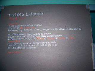
But should the whole thing be in monochrome? A huge poem, only in white and black? Probably a touch boring. Something had to give it some colour (pardon the pun)... Since the poem is to a certain point bilingual, the other language should be another colour. But which one? Since the poem is called "Speak white", should that be in white, and the rest of the poem in another colour? Since "speak white" is in English, should all the English be in white? A lot of mental tweaking of the visual aspects took place. In the end, I decided that the French text, as the majority of the poem, would be in white, and the English (including "speak white", ironically), would be in red.
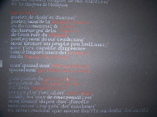
Next came the hands. What script to use? I had seen a wonderful NFB filming of Michèle Lalonde reading Speak White in 1970 (I get goosebumps everytime I watch her reading it, I'll be honest), and originally, I was thinking of keeping the red-white colour scheme, but varying the scripts depending on her tone of voice; a softer, more italic style when her voice was quiet, a gothic script when her voice was loud, aggressive. But how many scripts? Where do you decide that her tone went from soft to assertive, from assertive to aggressive? I was worried that the whole thing would just end up devolving into something along the lines of "look how many styles I can write!" So in the end, I went with a design that turned out being striking in its simplicity. French text in a white half-uncial script, English text in a red early gothic script. Of course, that would be too simple; there had to be hiccups. There are terms in French in half-uncial, but red, and English text in white early gothic. My reasoning was that the terms, while in French, represent English terms and concepts, and the French gothic is an answer, by the (Francophone) narrator, to an English question.

Oddly enough, even though I thought that the gothic script would be difficult to read, the half uncial turned out to be more difficult. Not because the letterforms were difficult (they're remarkably clear and easy to read), but because for some weird reason, I decided to go with what is called a "long s". The form for that letter we now use is called a "short s"; the "long s" looked like an 'f', and it, well, stopped the flow of the eye over the poem, since with every word where the long 's' appeared, and your brain had to go "oh, right, that's an 's', not an 'f'..."
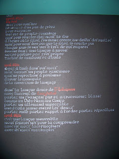
I didn't realize how big this was going to be, until I made my calculations. The full size of the boards is 1.6 m. I seem to recall starting to laugh in the staff room at work, when I realized how big this was going to turn out. To get the whole poem to fit on one board, I had to buy a 32"x40" board, cut it lenghtwise, and write it vertically, then attach the boards together, to make a single 20"x64" board. To make it portable, I attached the two boards using hinging tape, which allows me to carry the whole thing folded in half. This had the added effect of a double-whammy when I showed it to classes. The kids would see a big black board, covered in red and white fancy writing, then I would flick my wrist, and the bottom board would swing out, to a second, more stunned "whoa!" (I hope my memory isn't exaggerating).
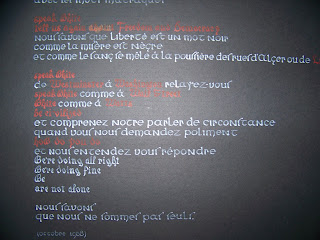
I expected this thing to take a long time to do, which was why I had started it over Christmas holidays, but it turned out only taking four hours. I'd be writing about 3-4 hours per day, and I was surprised at how "little" time it took me to do (which encourages me with two other projects I have planned).
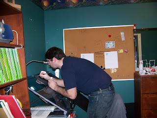
This was a great project to do early on, since I learned a lot... Would I do it again? Absolutely. I know it would take me less time than I think; I've learned to test how coloured ink contrasts on a non-white background (I thought the striking red would stand out more, and that it would be the white that would be problematic. Turns out it was the other way around). I've learned to check to make sure the longest line fits in the space I've planned for it. And check the bloody alphabet, to make sure it's legible!
Aucun commentaire:
Enregistrer un commentaire